• Hello everybody! We have tons of new awards for the new year that can be requested through our Awards System thanks to Antifa Lockhart! Some are limited-time awards so go claim them before they are gone forever...

    CLICK HERE FOR AWARDS

I don't know what to say


REGISTER TO REMOVE ADS
Status
Not open for further replies.

C4E

Procrastination is Key
Joined
Feb 8, 2005
Messages
1,372
Awards
1
Location
..
Website
www.cloud4ever.deviantart.com
VenMemory_zps3af24cb3.png


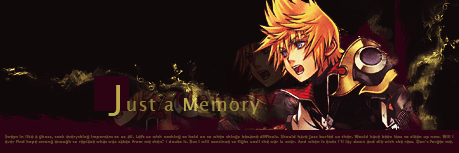
Here I am again. after another 2 year break.
This is my second tag in 4 years.
I just feel like getting back into things.
 

iDrops

It's a Farce...
Joined
Jul 15, 2011
Messages
840
Awards
6
Location
Rainland
It's really good, especially since it's your second tag in 4 years. Though I personally would like it better if Ven didn't stand out as much.
 

C4E

Procrastination is Key
Joined
Feb 8, 2005
Messages
1,372
Awards
1
Location
..
Website
www.cloud4ever.deviantart.com
Thanks.
Still experimenting with things. Making sure I can still do it right.

In case anyone ever wants to critique, and offer suggestions on how to finish these.

Basic.png
 

Shasta

Member
Joined
Feb 10, 2013
Messages
625
Awards
6
Age
29
Location
somewhere on twitter
Welcome back?

Yeah the tags look pretty nice, the Ven looks pretty fine to me, though I would have set a little opacity on the main Ven to where he didn't take away from the rest of the image.

For the second image, make sure your lights are evenly distributed, even if you are trying to highlight a specific thing.
 

Ðari

Look at you, armor-less
Staff member
Joined
Dec 15, 2005
Messages
9,614
Awards
10
Age
33
Location
Beyond the Final Destination
VenMemory_zps3af24cb3.png


Here I am again. after another 2 year break.
This is my second tag in 4 years.
I just feel like getting back into things.

I dont think there is much else you could do to this one given with what you've already done to it. Kind of surprised anyone still uses the basic dupe/clipping mask lol. I think for this I could only really suggest is for a little more dynamic with your background. It feels flatter than your stock, and with limited "presence" it doesn't capture interest but for a brief period of time. The Foreground and text kind of make up for that, but the color choice makes them almost hardly noticeable and aesthetically pleasing to the eye.

damn. Thanks for all the help guys!

Kula1.png


I used to never get responses unless I smudged the shit out of things.

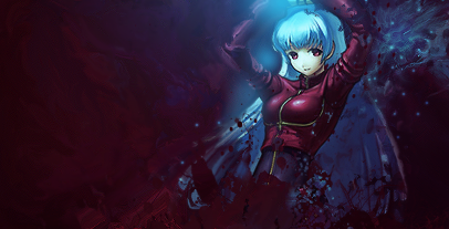
Color choice brotha, i feel like this could work. the smudging actually isn't too bad, if it was a little harder, (especially the left) and stood out more you'd be solid. The lightsource is pretty weak here, you can fix that easy with a few adjustment layers without taking away too much from the stock.

Thanks.
Still experimenting with things. Making sure I can still do it right.

In case anyone ever wants to critique, and offer suggestions on how to finish these.

Basic.png

I like the idea of this, but I i guess I'm being annoying about color choice and should probably stop lol. The vectoring is great, i think what would help this besides just reworking the colors to more prominent venerations, with with your effects like to the fair left. Don't be afraid to make a splash or two more, i think for the most part when you have things to take away, you're getting somewhere.
 

Nutari

The Scotsman
Joined
Jun 1, 2008
Messages
2,855
Awards
7
Location
Milwaukee
There's no way it has been for years C4E. You were doing a few tags just earlier this year. I lied. You're not the person I thought you were.
 
Status
Not open for further replies.
Back
Top