
You are using an out of date browser. It may not display this or other websites correctly.
You should upgrade or use an alternative browser.
You should upgrade or use an alternative browser.
i tried
- Thread starter Coeurl
- Start date
|
REGISTER TO REMOVE ADS |
|
- Status
- Not open for further replies.
- Joined
- Dec 23, 2007
- Messages
- 9,638
- Awards
- 3
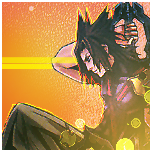
I honestly don't see either working. They're too simple, and the colouring isn't overly complimentary. With the Terra one, yes, there is more effort put into it, but he still looks a bit too thrown in. The yellow line continuing over his arm is just unnecessary, and takes away from the stock, and the avvie as a whole. If anything, they should be wider, and taking up more of the blank space, I think. I quite like the grainyness, as it adds to the avvie. The lighting effects in the bottom right corner do nothing for the avvie at all, and it just makes it look like you don't know what else to add to it.
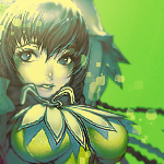
As for the second, it just looks like a hue change with the lighting effects again. Combine it with a nice background, and it would compliment the nice blurring job so much more.
As for the second, it just looks like a hue change with the lighting effects again. Combine it with a nice background, and it would compliment the nice blurring job so much more.
hmm i think i oversharpened the first a bit. the second well i was going to put a bg but then i thought it would look like a tag lol
pretty much that's what happened actually heheShinkirō;5013162 said:I honestly don't see either working. They're too simple, and the colouring isn't overly complimentary. With the Terra one, yes, there is more effort put into it, but he still looks a bit too thrown in. The yellow line continuing over his arm is just unnecessary, and takes away from the stock, and the avvie as a whole. If anything, they should be wider, and taking up more of the blank space, I think. I quite like the grainyness, as it adds to the avvie. The lighting effects in the bottom right corner do nothing for the avvie at all, and it just makes it look like you don't know what else to add to it.
i tried for simpler this time. but i guess you two are right about the bgAs for the second, it just looks like a hue change with the lighting effects again. Combine it with a nice background, and it would compliment the nice blurring job so much more.
- Status
- Not open for further replies.