• Hello everybody! We have tons of new awards for the new year that can be requested through our Awards System thanks to Antifa Lockhart! Some are limited-time awards so go claim them before they are gone forever...

    CLICK HERE FOR AWARDS

Mi Comic and and some bots


REGISTER TO REMOVE ADS
Status
Not open for further replies.

gene chaos

New member
Joined
Jun 24, 2006
Messages
894
Location
Somewhere between here and nowhere
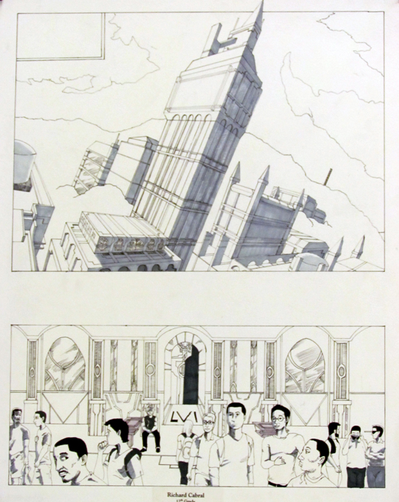
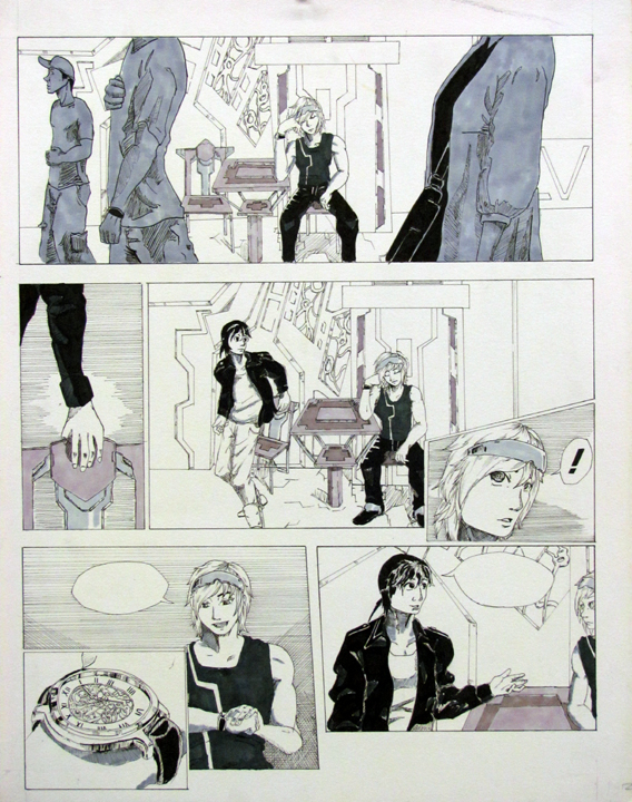
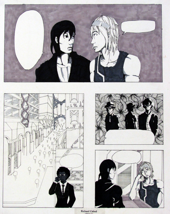
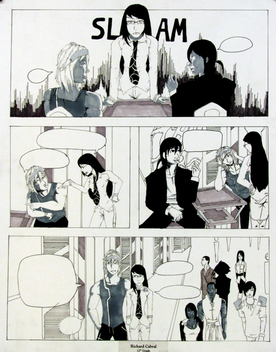
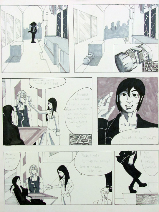
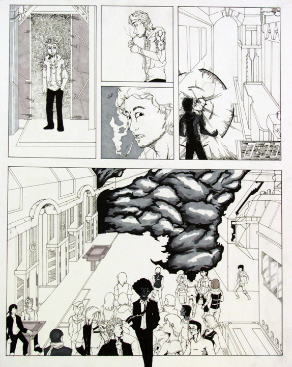
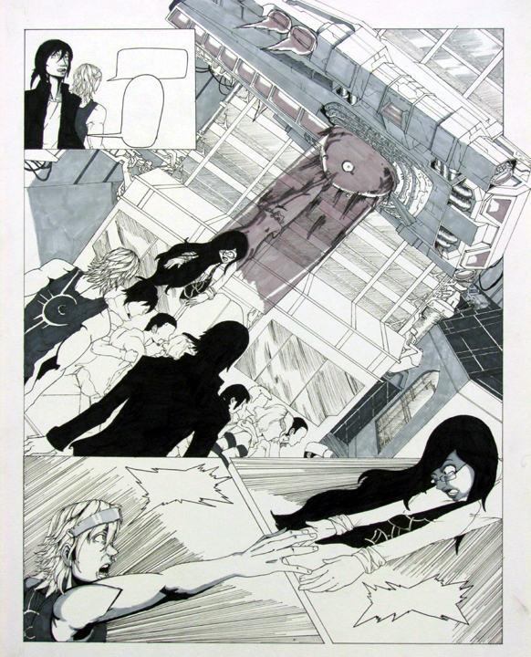
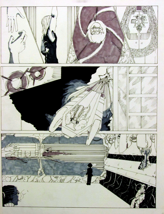
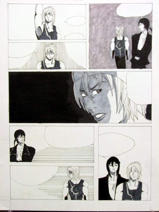
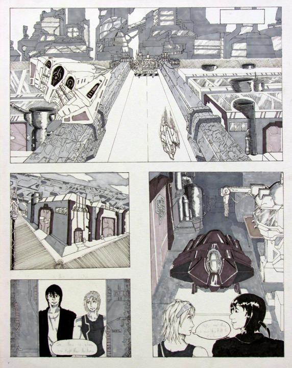
This comic i've been doing in my art class

Spoiler Spoiler Show

Spoiler Spoiler Show

Spoiler Spoiler Show

Spoiler Spoiler Show

Spoiler Spoiler Show

Spoiler Spoiler Show

Spoiler Spoiler Show

Spoiler Spoiler Show

Spoiler Spoiler Show

Spoiler Spoiler Show

Erebues on deviantARTPg 11
Erebues's deviantART GalleryPg 12

wanted to know what u guys thing i should do to improve the next one.

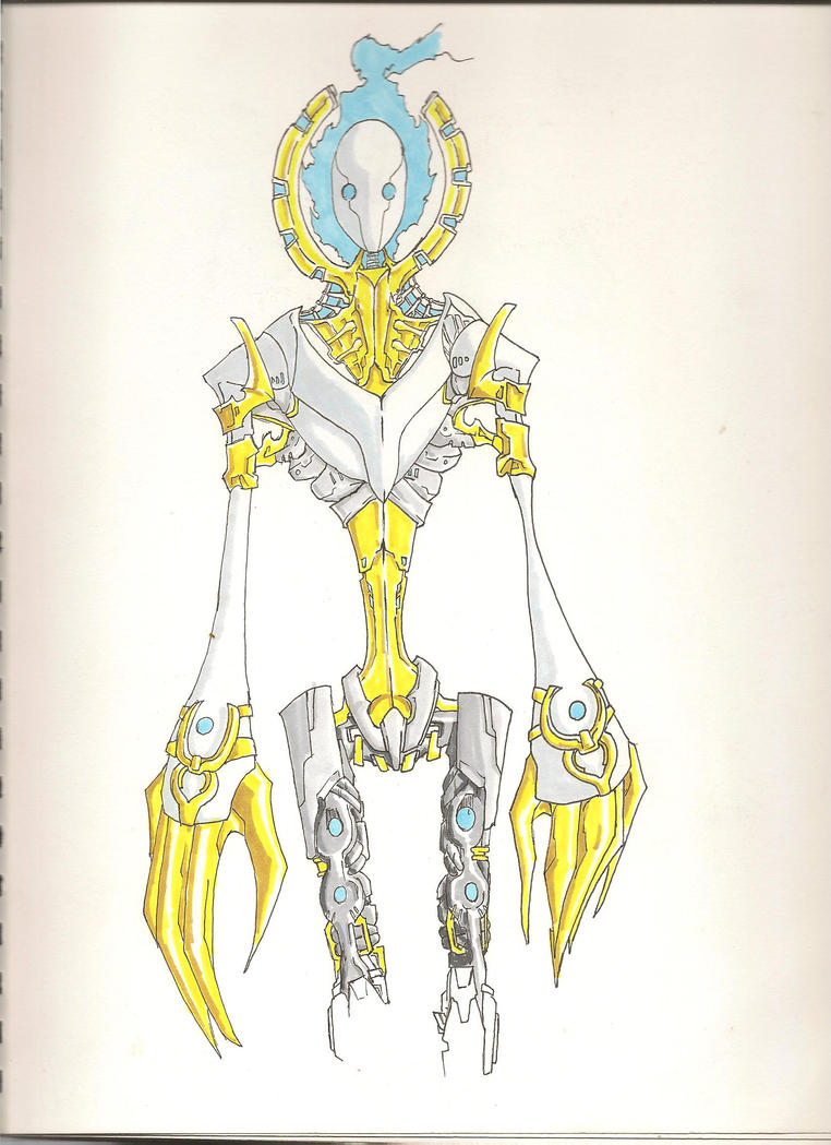
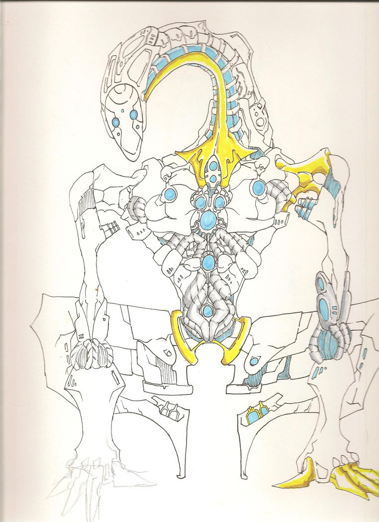
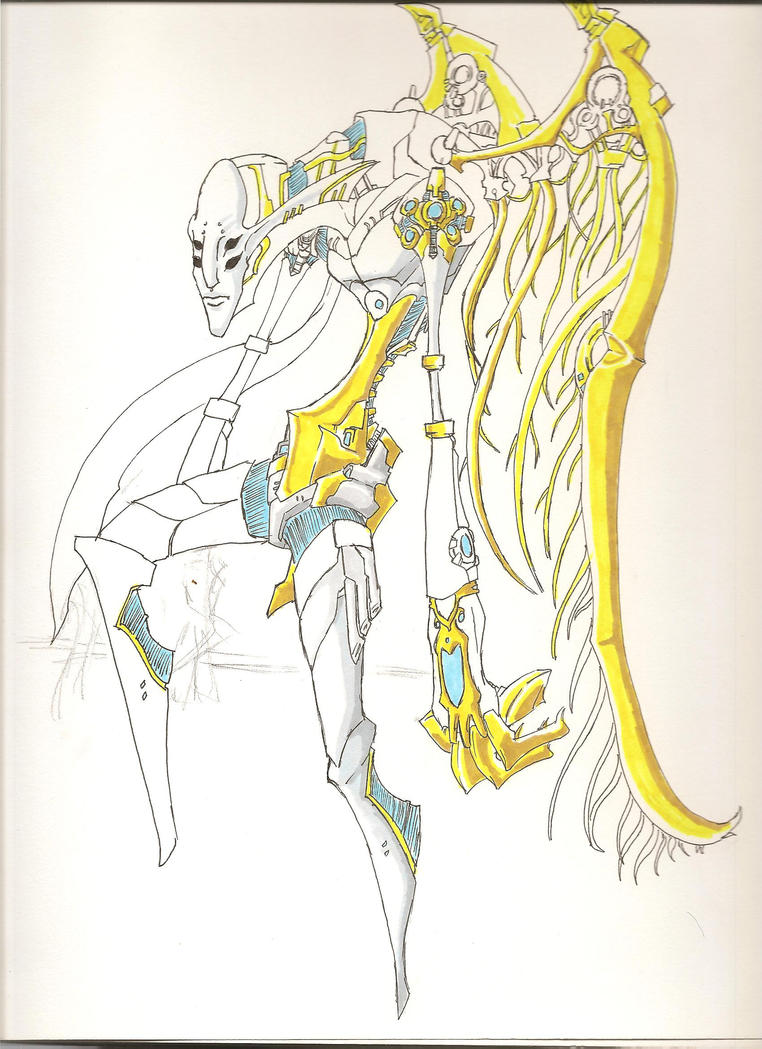
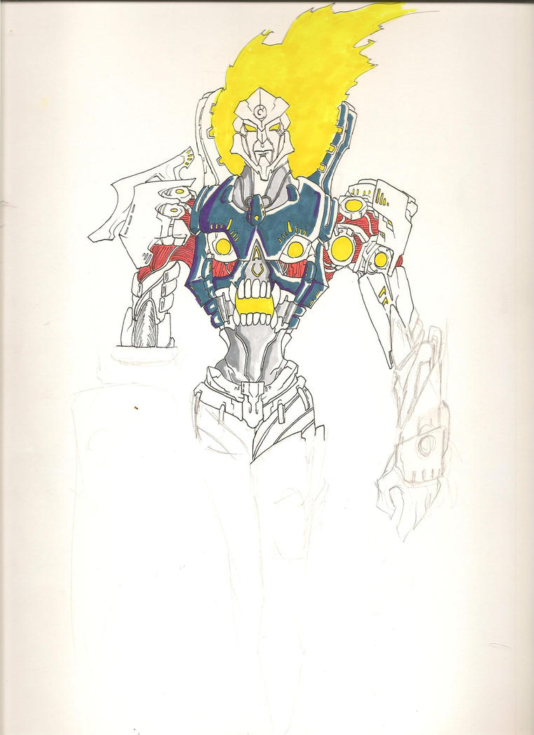
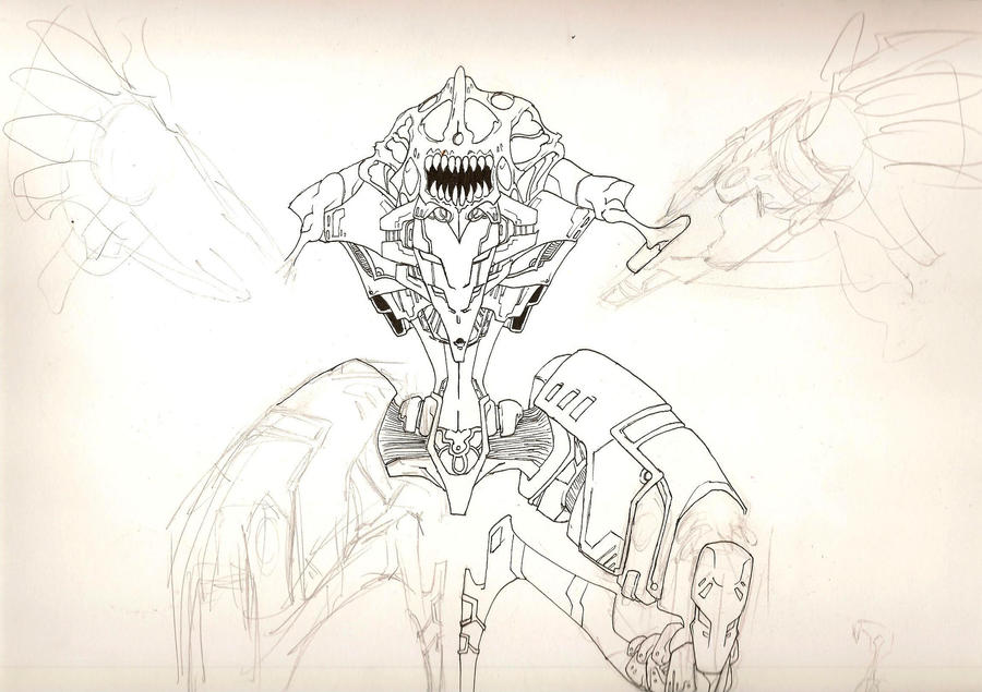
also here are some robots.

Erebues on deviantART
 

Jozi

Du-dun-dananana Calibrations!
Joined
Jan 11, 2008
Messages
1,125
Location
'Merica
No offense, but that was pretty fruzlinking amazing o,o The city-scape is just... fruzlinking amazing o,o
 

quiteMAD

What a guy!
Joined
Jan 4, 2006
Messages
6,887
Awards
1
Location
In your head.
Website
defineprog.deviantart.com
Your anatomy could use some work (like that arm/hand at the bottom left of page 7), but man the scenery is pretty amazing. I'm going to take a wild guess, and say you're a Tstomu Nihei fan? If not, you should be.
 

Ophan

Airman
Joined
Aug 13, 2008
Messages
5,170
Awards
3
Location
Atsugi Kanagawa
Website
zionphnx.deviantart.com
I have to agree. The scenery is crazy good, your use of markers to apply shadows made it all the more better. Though i have to go with quiteMAD on this one, the anatomy is a little off, but time and work can really amp your quality in the future. Keep at it man
 

gene chaos

New member
Joined
Jun 24, 2006
Messages
894
Location
Somewhere between here and nowhere
Your anatomy could use some work (like that arm/hand at the bottom left of page 7), but man the scenery is pretty amazing. I'm going to take a wild guess, and say you're a Tstomu Nihei fan? If not, you should be.


yah there alot of anatomical mistakes, really need to start drawing from life again, and i've never heard of Tsutomu Nihei, and if i have seen any of his works my memory is just failing me at this particular moment.

and to be honest i loved doing the backgrounds more than i did the characters. Hell they got changed so many times and i still didn't fit my teachers idea of interesting compared to the background that i gave up and gave them plain outfits.

also thanks you guys.

edit// it did seems i have read one of his works"Abara", i liked the scenery in it though it was a bit difficult to understand some of the pages, might have been bad scans who knows.
 
Last edited:

Tsuki-chan

つきこ
Joined
Jun 23, 2005
Messages
1,133
Awards
3
Location
Outside, since the AP exams are over :D
Holy Fudge, the scenery is fanatastic. I could only imagine doing that. I also like the diversity of the characters appearances, especially when they're in the crowds (It makes it look more realistic.) It makes it stick out more. It's a great start.
 

gene chaos

New member
Joined
Jun 24, 2006
Messages
894
Location
Somewhere between here and nowhere
@ Tsuki-chan i take alot of pictures so everyone in the comic is someone i know, well execpt for most of the crowd on pg 1.

also i've alway envisioned what my robots colors would be but for me i feel that the flow i was looking for isn't there. so i want suggestions.

this one i like how the colors came out and i've based the others off of this.
Spoiler Spoiler Show


Spoiler Spoiler Show

Spoiler Spoiler Show


Spoiler Spoiler Show

this last one was gurren lagaan based because my friend said another one had something that looked like a face in it.

so any idea's for what i should use for a primary color base for these ?
 

Vayne Mechanics

Expert of Asian things
Joined
Mar 27, 2005
Messages
8,780
Awards
3
Really, really clean artwork. Scenery is definitely your forte; people? not so much. A lot of the panels in your comics are somewhat bland due to either composition, no dynamics or lack of background. The bigger panels have great backgrounds but the smaller ones? Not so much.

Detail and linework is fantastic on the robots. I understand it's conceptual, but maybe more dynamic poses and the like.
 

gene chaos

New member
Joined
Jun 24, 2006
Messages
894
Location
Somewhere between here and nowhere
honestly people bore me, so the scenery was fun to do until i got tired with all the little details.

also a friend said something to me about the basic pose for the robots so i developed this is this different enough?

Spoiler Spoiler Show


i have another two half completed in blue lead so i doubt they would show.
 

Vayne Mechanics

Expert of Asian things
Joined
Mar 27, 2005
Messages
8,780
Awards
3
Well if you're just laying out the details and whatnot, the basic pose always works well. But if they're things you're going to be drawing more frequently, use more dynamic poses to expose different parts of their body.
 
Status
Not open for further replies.
Back
Top