• Hello everybody! We have tons of new awards for the new year that can be requested through our Awards System thanks to Antifa Lockhart! Some are limited-time awards so go claim them before they are gone forever...

    CLICK HERE FOR AWARDS

One of my First Attempts...


REGISTER TO REMOVE ADS
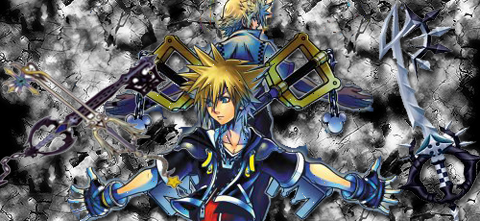
Status
Not open for further replies.

Master Sora

New member
Joined
Mar 1, 2009
Messages
385
Awards
6
Location
Destiny Islands
Website
soraboots.tumblr.com
Acrossing.png


It was pretty tough trying to make a real good one at first.:96:
 
H

Hellpark

Guest
Fuck if you weren't 15 I'd take you as an apprentice.
 

Cloud_Unchained

Hooray! Hooray!
Joined
Dec 24, 2004
Messages
4,231
Age
33
For a first attempt, it's not a bad start. There a couple things that you should keep in mind though.

First of all, you've got waaaaaay too many things scattered around. When making a tag, try to keep it as focused as possible. In this case, omit the keyblades on both sides. That way, the focus would be on the stock, which would be Sora and Roxas. Taking out Roxas would also be a good idea, so that the whole thing would just revolve around Sora.

Second, you've got to remember size. I don't remember who, but when I first started, I remembered someone telling me that the bigger the canvas, the more space you have to fill. Not to say negative space is bad, but there's no negative space in this tag. It's all filled up with a repetitive background.

Next, coloring. try to have the whole piece in one color scheme. It's more friendly to the eyes. And it looks better. For this one, there was good potential to use blues, yellows, some pinks, and the like. If you can't decide what colors to use, try borrowing some colors from the stock. It'd help with blending and even lighting if you're a bit farther along.

Remember to start with the stock first and then work around it, rather than making premade backgrounds and trying to blend your stocks in with it. Gives it a more "organic" look, for a lack of better terms.

Keep trying, though. You only get better with practice.
 

Master Sora

New member
Joined
Mar 1, 2009
Messages
385
Awards
6
Location
Destiny Islands
Website
soraboots.tumblr.com
For a first attempt, it's not a bad start. There a couple things that you should keep in mind though.

First of all, you've got waaaaaay too many things scattered around. When making a tag, try to keep it as focused as possible. In this case, omit the keyblades on both sides. That way, the focus would be on the stock, which would be Sora and Roxas. Taking out Roxas would also be a good idea, so that the whole thing would just revolve around Sora.

Second, you've got to remember size. I don't remember who, but when I first started, I remembered someone telling me that the bigger the canvas, the more space you have to fill. Not to say negative space is bad, but there's no negative space in this tag. It's all filled up with a repetitive background.

Next, coloring. try to have the whole piece in one color scheme. It's more friendly to the eyes. And it looks better. For this one, there was good potential to use blues, yellows, some pinks, and the like. If you can't decide what colors to use, try borrowing some colors from the stock. It'd help with blending and even lighting if you're a bit farther along.

Remember to start with the stock first and then work around it, rather than making premade backgrounds and trying to blend your stocks in with it. Gives it a more "organic" look, for a lack of better terms.

Keep trying, though. You only get better with practice.

Wow..Thanks a lot ^-^..I'll be sure to remember that :lol:
MasterSora2.png

Here's another too.

Oh and HellPark, I made these like a year ago lol:lol:
 
Status
Not open for further replies.
Back
Top