
You are using an out of date browser. It may not display this or other websites correctly.
You should upgrade or use an alternative browser.
You should upgrade or use an alternative browser.
SOTWW entry
- Thread starter Kk_s
- Start date
|
REGISTER TO REMOVE ADS |
|
- Status
- Not open for further replies.

I hate to say it, but that's a bit over the boundaries of what might pass as a 'signature,' least of all for the competition.
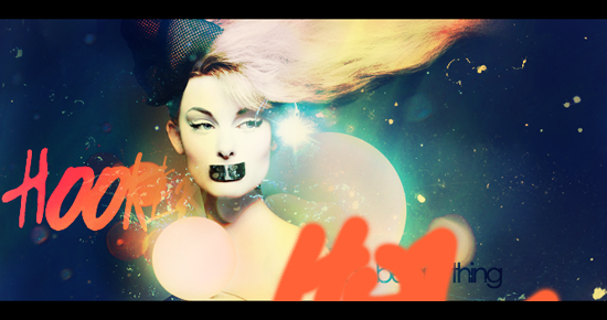
However, on what the actual piece offers: your eyes dart all over the image. Other details are nice but your main focus should the stock image, and as such you need to bring it out more. I'd consider actually making something with the solid circles. On one hand they're nice and all with different layers of distortion throughout from zero to maxed, but on the other hand it just looks unfinished with everything else that's going on. And I suppose as a final gripe, the edges of the text could use being smoothed out and not be so jagged.
Otherwise it's not bad- it just doesn't feel finished.
Glad to see that you downsized for SotW, ahah. I actually prefer the smaller one, btw. Only suggestion i have is to play with lighting more. In that respect it's pretty flat at the minute, play on the effects you've already got like maybe adding more shade to the left of her face and make it ultra bright when the star effect is next to the right of her face. I also think it'd look nice with some text on the bottom right, just slightly over the stock to add a little bit more depth.


D:
The font doesn't have the option to bold D: D: D: D:
Lol if you click on the move button (the very top one on the left toolbar with the mouse and the 4 arrows, that one) then click on free transform (it should be a checkbox) then pull it out width-wise, then it will be bolder for you

Sometimes though it will be more blurry... so just don't drag it out too much.
That's why you just do it a little bit, and not make it super bolded (I only do it for clipping masks anyways but still it will bold)
ANYWAYS, some real cnc, this is really great, the colors, the effects, are all very nice. My only crit is that the black border could be removed, like Cloud says, have less text. I would say just get rid of the "hears" (I think that's what it says lol) and just keep the orange word because the red just takes away from the focal. I don't really think you need to bold it if you just do that... ._.
(I only do it for clipping masks anyways but still it will bold)ANYWAYS, some real cnc, this is really great, the colors, the effects, are all very nice. My only crit is that the black border could be removed, like Cloud says, have less text. I would say just get rid of the "hears" (I think that's what it says lol) and just keep the orange word because the red just takes away from the focal. I don't really think you need to bold it if you just do that... ._.
- Status
- Not open for further replies.