• Hello everybody! We have tons of new awards for the new year that can be requested through our Awards System thanks to Antifa Lockhart! Some are limited-time awards so go claim them before they are gone forever...

    CLICK HERE FOR AWARDS

The Zion can Draw


REGISTER TO REMOVE ADS
Status
Not open for further replies.

Finland

Banshee Queen
Joined
Jun 10, 2008
Messages
7,441
Awards
4
Age
30
Awesome, awesome, awesome. I'm starting to get a bit too repetitive...
It's just so amazing, that you can draw like that. :3 You have great skills, don't waste them or let them fade into oblivion. (I'm starting to be poetic. XD)
 

Ophan

Airman
Joined
Aug 13, 2008
Messages
5,170
Awards
3
Location
Atsugi Kanagawa
Website
zionphnx.deviantart.com
i admire your repetitiveness, LOL.
I always appreciate your comments

don't waste them or let them fade into oblivion
sounds like something out of KH

Fallen_for_Angel_by_ZionPhnx.jpg
 
Last edited:

╬ProperArtist╬

Instantly Classic
Joined
Dec 23, 2005
Messages
3,803
Awards
1
Age
34
Location
Wait What?
Website
the13thmember.deviantart.com
I do believe your work is better after it's photoshoped because the way you color is so saturated, that mixed with the dark tones of your pens(?) makes the color jump out that much more.

Honestly though I can't say I'm a fan of the new Joker picture the head seems to be a bit too big and seeing as you were obviously going for Heath Ledger's Joker it could stand to use some improvements in the facial area if you really are going to replace that with the original piece.

The only other thing I've noticed in you original work is that the ridge between the eyes and nose tends to be too long which tends to make their faces stretched out, making the mouth appear lower than it should. Now if that's your calling card then that's fine, adding your own personal flare to each piece is all fine (stylistic) however, if it's unintentional then you should take a little bit of time to work on that part of your faces.

Other than that I'm astounded by your quickness, if I could crank out half as many drawings a week as you do I'd have it made but I can't do that obviously because they take too much energy out of me :/
 

Swift

New member
Joined
Jan 12, 2009
Messages
59
Why don't you start selling arts at Da? I bet you can make a great start. :D
 

Finland

Banshee Queen
Joined
Jun 10, 2008
Messages
7,441
Awards
4
Age
30
i admire your repetitiveness, LOL.
I always appreciate your comments

sounds like something out of KH

Fallen_for_Angel_by_ZionPhnx.jpg

KH? Because of the word "oblivion"? XDD
Well, I have been playing it too much, I guess... oh please forgive me for liking that game. :3

Nice, now the angel looks poisonous! :D!
 

Orion

Prepared To Die
Joined
Sep 17, 2007
Messages
20,385
Awards
10
Poison angel! Wait, it was an angel to begin with?

Eh, I find it too monotone, and the face not properly shaped.
 

Ophan

Airman
Joined
Aug 13, 2008
Messages
5,170
Awards
3
Location
Atsugi Kanagawa
Website
zionphnx.deviantart.com
╬ProperArtist╬;3638241 said:
I do believe your work is better after it's photoshoped because the way you color is so saturated, that mixed with the dark tones of your pens(?) makes the color jump out that much more.

Honestly though I can't say I'm a fan of the new Joker picture the head seems to be a bit too big and seeing as you were obviously going for Heath Ledger's Joker it could stand to use some improvements in the facial area if you really are going to replace that with the original piece.

The only other thing I've noticed in you original work is that the ridge between the eyes and nose tends to be too long which tends to make their faces stretched out, making the mouth appear lower than it should. Now if that's your calling card then that's fine, adding your own personal flare to each piece is all fine (stylistic) however, if it's unintentional then you should take a little bit of time to work on that part of your faces.

Other than that I'm astounded by your quickness, if I could crank out half as many drawings a week as you do I'd have it made but I can't do that obviously because they take too much energy out of me :/

it is unintentional, so the measurements of the head do need work. I think your identification of my work is true, and if i could adhere to that advice, I may be able to fix/ improve that problem.
thank you ╬PA╬
:D

Why don't you start selling arts at Da? I bet you can make a great start. :D

i'm kinda scared to. I don't think i'm up there yet to selling my art

KH? Because of the word "oblivion"? XDD
Well, I have been playing it too much, I guess... oh please forgive me for liking that game. :3

Nice, now the angel looks poisonous! :D!

i'm not disappointed in someone liking KH
I would have to have like KH to be here in the first place,
although i was a little disappointed with KH2. Nevertheless,
i'm excited for the next installments.

The Angel is now poisonous, LOL
 

Swift

New member
Joined
Jan 12, 2009
Messages
59
The new joker has a better feeling. I'm guessing the lower lips is a little off?
 

Cicero

Visionary
Joined
Jan 7, 2006
Messages
1,659
Location
brilliant chaos
Ew, the pictures of the Angels and that green woman and all are better without the color. <3 Right now it looks like your over did it...

Same for the Master chief though, albeit my opinion is biased, as I love originals and raw sketches.

Jokers nice though, especially the last edit.
 

╬ProperArtist╬

Instantly Classic
Joined
Dec 23, 2005
Messages
3,803
Awards
1
Age
34
Location
Wait What?
Website
the13thmember.deviantart.com
this time i remastered it, so hopefully it's better

The_Joker_by_ZionPhnx.jpg


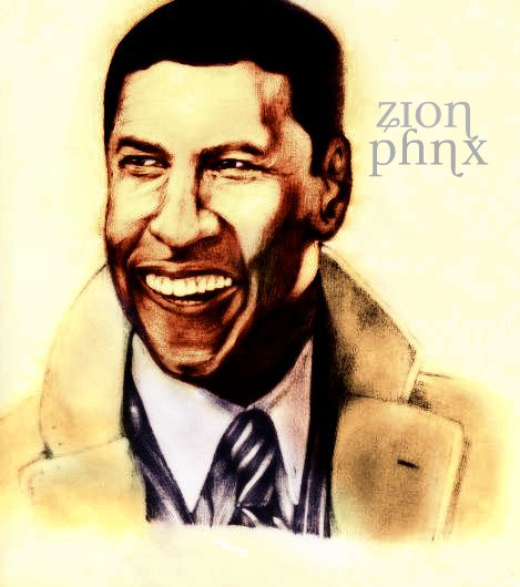
and Denzel with color,
because it had to happen

Denzel_Washington_by_ZionPhnx.jpg


and yes, his mouth is still funny looking.....

The Joker piece could still use some work. I really like how the mouth turned out but the face is still elongated making the eyes appear too small in comparison to the rest of the face. Now it feels as though it's a mix of both Batman the animated series Joker and Heath Ledger's Joker and if this was your intention then it's working. However, if you were going for more of a Dark Knight feel then you've still got some editing to do.

On to the Denzel piece.
Yes the mouth is really bothering me in this. It's not so much the placement of the mouth as the lower lip being too far over to the left. His chin area is also a bit too long.
 

Ophan

Airman
Joined
Aug 13, 2008
Messages
5,170
Awards
3
Location
Atsugi Kanagawa
Website
zionphnx.deviantart.com
don't worry i'm still editing it.
I'm taking my time on an even better Joker pick though.

the Denzel picture his given me a lot of trouble, but it wasn't
a recent picture i did either.

in any case, this was the original, and my mistakes are more vibrant

hyyttt.jpg
 

Ophan

Airman
Joined
Aug 13, 2008
Messages
5,170
Awards
3
Location
Atsugi Kanagawa
Website
zionphnx.deviantart.com
Ew, the pictures of the Angels and that green woman and all are better without the color. <3 Right now it looks like your over did it...

Same for the Master chief though, albeit my opinion is biased, as I love originals and raw sketches.

Jokers nice though, especially the last edit.

i didn't see this right away.
in a way your right, you could consider them overdone.
everyones opinion is different, but i always have the raw sketches of course.
Sometimes my complaint can consider lack of color, and if after that it seems
to be measurements, and anatomical problems.

in any case, this was supposed to be the final Master Chief
but i.....y'know, overdid it.

2ed70rc.jpg


i figured it made him pop out more,
but i thought people would think it was too dull
but like i said, everyone's likes are different
 
Status
Not open for further replies.
Back
Top