You are using an out of date browser. It may not display this or other websites correctly.
You should upgrade or use an alternative browser.
You should upgrade or use an alternative browser.
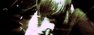
Another 'decent' one
- Thread starter Decron
- Start date
|
REGISTER TO REMOVE ADS |
|
- Status
- Not open for further replies.
Stock looks LQ, its way tooo blended in with the bg. Also the lighting on his face is a bit much. Another thing, its too monotone. Try using different colors..nice try though..
- Joined
- Apr 5, 2006
- Messages
- 4,628
- Location
- On the outer rim of the local ghetto
- Website
- kazu52.deviantart.com
Some times you say things that make no damn since.Stock looks LQ, its way tooo blended in with the bg. Also the lighting on his face is a bit much. Another thing, its too monotone. Try using different colors..nice try though..
What? it's not LQ, it's just extremely dark. The lighting has got to be re done in this one it looks horrid. You have the lighting coming the opposite direction of the stock. As a result the lighting looks unnatural,and looks like it's coming all over the place. Redo the lighting and get rid of the scan lines. I like the flow you got going it,and the colors work. But it's still very bland and empty. Lighten up the background(stock too),and add more effects to the BG. Use some textures,and then put a C4d over it blend it in and see if that works. Your getting better keep it up.
Some times you say things that make no damn since.
What? it's not LQ, it's just extremely dark. The lighting has got to be re done in this one it looks horrid. You have the lighting coming the opposite direction of the stock. As a result the lighting looks unnatural,and looks like it's coming all over the place. Redo the lighting and get rid of the scan lines. I like the flow you got going it,and the colors work. But it's still very bland and empty. Lighten up the background(stock too),and add more effects to the BG. Use some textures,and then put a C4d over it blend it in and see if that works. Your getting better keep it up.
The lightning is actually a C4d
And yes it's kind of dark, but i set the opacity of the burn to high i guess
But next one i'm going to use some smudge tuts etc.
- Status
- Not open for further replies.


