
You are using an out of date browser. It may not display this or other websites correctly.
You should upgrade or use an alternative browser.
You should upgrade or use an alternative browser.
AIR
- Thread starter Sean
- Start date
|
REGISTER TO REMOVE ADS |
|
- Status
- Not open for further replies.


Hey my shift thing is trending
I'll commen on this when i get a computer
I'll commen on this when i get a computer
- Joined
- Apr 26, 2007
- Messages
- 4,531
- Awards
- 1
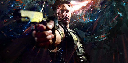
This was hands down the most fun piece I've ever made. Albeit this is the first time I've done anything like it. I just really like coloring in the lines idk.
But I couldn't really figure out how to make the focal stand out more without screwing up the entire thing.
But I couldn't really figure out how to make the focal stand out more without screwing up the entire thing.
I actually like what you did to make the focal stand out. Normally, what I'd expect to see to get the focal stand out is to make it seems as thought it is popping out from the pages, but this is the opposite. I think it's pretty neat that you have the focal drop farther into the pages.
- Joined
- Mar 9, 2006
- Messages
- 2,881
- Awards
- 1
I'm not really a fan of Pablo's light shift on the whole stock, so it might look cooler if you just had it on parts of him, like on his feet or whatever he's holding to create a little sense of movement
I like the coloring but it seems like you went a little exclusion layer happy
I like the coloring but it seems like you went a little exclusion layer happy
- Joined
- Apr 26, 2007
- Messages
- 4,531
- Awards
- 1
I actually like what you did to make the focal stand out. Normally, what I'd expect to see to get the focal stand out is to make it seems as thought it is popping out from the pages, but this is the opposite. I think it's pretty neat that you have the focal drop farther into the pages.
Hm well I thought of one of Andro's pieces from wayyyyyyy back and tried to use that as reference. The only reference I had was from my head nothing visual. So yeah this is what I got. :<
I'm not really a fan of Pablo's light shift on the whole stock, so it might look cooler if you just had it on parts of him, like on his feet or whatever he's holding to create a little sense of movement
I like the coloring but it seems like you went a little exclusion layer happy
I ONLY USED ONCE EXCLUSION LAYER
I do see what you mean with the shift though. Kinda lazy to go back and change it heh
guise lets be real only i can pull off the shift

inb4 bada- ohwait.guise lets be real only i can pull off the shift
- Joined
- Mar 9, 2006
- Messages
- 2,881
- Awards
- 1
guise lets be real only i can pull off the shift
wat r u talkin bout :<


- Status
- Not open for further replies.