• Hello everybody! We have tons of new awards for the new year that can be requested through our Awards System thanks to Antifa Lockhart! Some are limited-time awards so go claim them before they are gone forever...

    CLICK HERE FOR AWARDS

Right Zack at ya! [Updated - again]


REGISTER TO REMOVE ADS
Status
Not open for further replies.

Dawninmyheart

New member
Joined
Nov 23, 2009
Messages
649
Awards
1
Age
30
Location
Midgard
Website
users.livejournal.com
Fourth, Zack Fair will appear,
Wearing his smile that is not so rare
And bringing his friends courage and cheer.

-My poem, Birth by Sleep
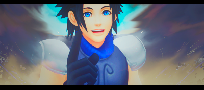

OlympusColiseum5.png


OlympusColiseum5copy.png


OlympusColiseum5copy1.png


Updated versions:

OlympusColiseum2copy1.png


OlympusColiseum2.png


OlympusColiseum2copy.png


OlympusColiseum2copy2.png


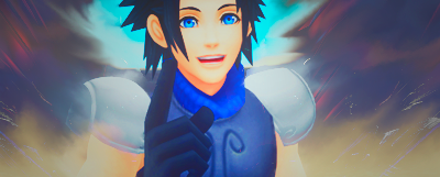
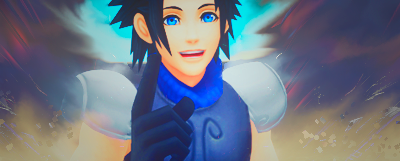
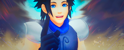
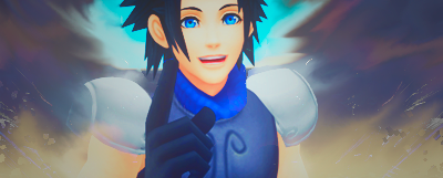
This is definitely the best smudging I've ever done. I do indeed intend to submit one of these in this week's SOTW. What do you guys think?
 
Last edited:

LongLiveLife

Bronze Member
Joined
Aug 11, 2010
Messages
2,102
Re: Right Zack at ya!

The concept is nice, but it feels a little lacking; there is too much empty space. The cropping and placement of the stock, however, is perfect. That said, the second is by far my favorite of the three.
 
Joined
Mar 24, 2005
Messages
4,708
Awards
2
Age
66
Location
Probably in some gutter.
Re: Right Zack at ya!

Use curves, mainly for your background.

Also, Smooth smudging is great, but yours is just a little too so. At least, to make a whole tag.

I think with some key brushing, maybe a little 'harder' brushing (though sparingly), and then some curves layer, with erasing on it's layer mask, you could have something nice.
 

LongLiveLife

Bronze Member
Joined
Aug 11, 2010
Messages
2,102
Re: Right Zack at ya! [Updated]

My favorite of the updated ones is the third. I love that spash of red you added; it the tag a lot more interesting! But yes, you will definitely want to toy around with the contrast of your background, or else it won't 'pop' the way you want it to.
 

Dawninmyheart

New member
Joined
Nov 23, 2009
Messages
649
Awards
1
Age
30
Location
Midgard
Website
users.livejournal.com
Re: Right Zack at ya! [Updated]

OlympusColiseum2copy2.png


I think it look ten times better than all the rest. And yes, I did add contrast. Thanks again, guys! I'll add it to the first post for comparison...
 

LongLiveLife

Bronze Member
Joined
Aug 11, 2010
Messages
2,102
Much better! I agree, it is the best of this set that you published. The contrast makes a world of a difference. Good job!
 
Status
Not open for further replies.
Back
Top