
You are using an out of date browser. It may not display this or other websites correctly.
You should upgrade or use an alternative browser.
You should upgrade or use an alternative browser.
am i cool yet
- Thread starter Coeurl
- Start date
|
REGISTER TO REMOVE ADS |
|
- Status
- Not open for further replies.
C
Colours
Guest
If you ask that, then your not cool hun. Also it's too big, resize it.
- Joined
- Jan 18, 2006
- Messages
- 1,933
- Age
- 31
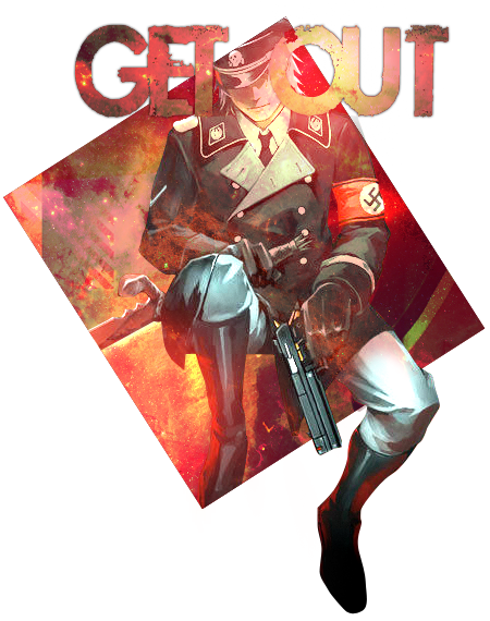
Love the one with the text. Only thing that bothers me is that the text is over his face. So make the "O" no be smack dab on top of his face.
One of your best pieces imo.
One of your best pieces imo.
hehe kkIf you ask that, then your not cool hun. Also it's too big, resize it.
i'll post it if it doesn't look uglyLove the one with the text. Only thing that bothers me is that the text is over his face. So make the "O" no be smack dab on top of his face.
One of your best pieces imo.
 ...and thanks for lurking around my works, i guess. hehe
Text version is best imo. If you were to put the "O" of Out behind the guy, then it'll look pretty sick.
Totally digging this C:
Totally digging this C:
- Joined
- Nov 6, 2009
- Messages
- 2,159
- Awards
- 4
Luv it.
Just fix the 'O's position.
Just fix the 'O's position.
noticed a lot of people making things like these so i thought i'd make something too.
I blame KRANK for everything. I don't hate the 'O' It's just no 'I' friendly LOL!!! I'm not funny i know.
I like your colour scheme and effects but i'm iffy about the scan lineish texture on the left.
nah, you're funny man xDI blame KRANK for everything. I don't hate the 'O' It's just no 'I' friendly LOL!!! I'm not funny i know.
thebatman
it's actually part of the texture. hmm but i thought it looked good.I like your colour scheme and effects but i'm iffy about the scan lineish texture on the left.
If you ask that, then your not cool hun. Also it's too big, resize it.
Wouldn't be much of an lp anymore, now would it?
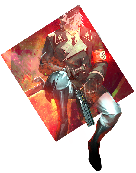
And actually, it's a splash, at that size.
The O looks like it's eating his face.
I do love the fact you didn't make the gun all colored overy....It looks sexier that way c:
I like the scanlines D:
I do love the fact you didn't make the gun all colored overy....It looks sexier that way c:
I like the scanlines D:
i wanted the gun to look like it's coming out of the piece so yeah.
and what's up with the O-hate?
and what's up with the O-hate?
ah so it's a splash then. got itWouldn't be much of an lp anymore, now would it?
And actually, it's a splash, at that size.
Last edited:
- Status
- Not open for further replies.