
Update:
Another Update:
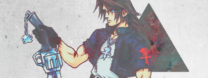
This is not a KR∆NK production. Critique, please.
Last edited:
|
REGISTER TO REMOVE ADS |
|
")
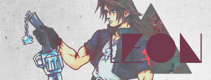
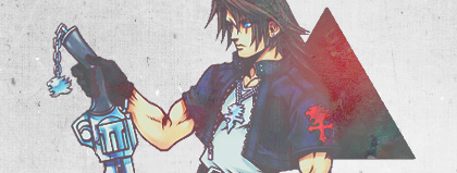
That's the o in Leon. ._. Maybe I should use different font...The second has a nice angle, but the circle over Squall is over-doing it.
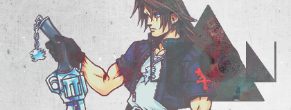
This what you're looking for?KR∆NK;5317097 said:don't do the text, and add some lighting effects
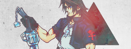
I've been eyeing that first one for too long, may I wear it?